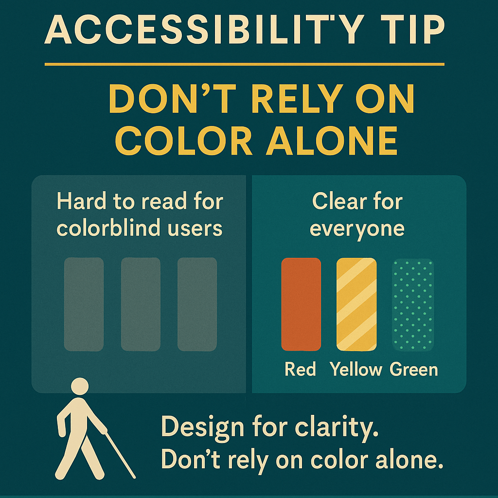
Accessibility Tip of the Week: Don’t rely on color alone
When designing charts, forms, or anything visual, color can be helpful—but it shouldn’t be the only way you convey information.
Not everyone sees color the same way. Relying on red for “stop” or green for “go” leaves some people out.
Here’s how to make your design more accessible:
Add text labels or icons Use patterns or textures Test with a colorblind simulator
Design for clarity. Don’t rely on color alone.
Got an accessibility tip to share? Drop it in the comments—we might feature it next week.

Leave a comment